

Spielregeln
fürs Klima
Type of project: Client request
Scope: Conceptualisation of the gamification principles, design of a web application, handover and control of technical implementation.
Role: UI Design Lead, illustrator and support with UX design and conception (working for spacepilots GmbH)
Webseite: spielregelnfuersklima.de
Client: Co2 Abgabe E.V.
Project duration: 4 months
Year: 2021
Design and conception for an online game to push better climate policies in the German federal elections of 2021.
Together with spacepilots I was able to play a pivotal role in this project, in which I worked as a UI Lead, UX Designer and lead researcher. We had the chance to collaborate with our client for a project with a big purpose: getting better climate policies for the german federal elections of 2021.

The problem
Our client was concerned that the measures proposed in the election programmes for the 2021 federal election in Germany were far from enough to save the climate.
Therefore they wanted to create a web application based on a gamification concept to explain what measures can be taken to improve this.
The goals

Raise awareness of the impact that policies have on the climate and what action would be needed to improve the situation.

Activate users to contact politicians so they take action and change their programmes into more effective ones.
The solution

We designed a web application in which users play the role of MPs and have to shape economic rules and laws in such a way that Germany saves as many CO2 emissions as possible by 2030.
Target Group
1. Climate-interested and online-savvy voters
The game is not only aimed at a target group with an affinity for games, but to all voters and those interested in climate protection. The game should
be usable and accessible for everyone.
2. Indirect target group: Candidates in the Federal Parliamentary Elections.
Persona

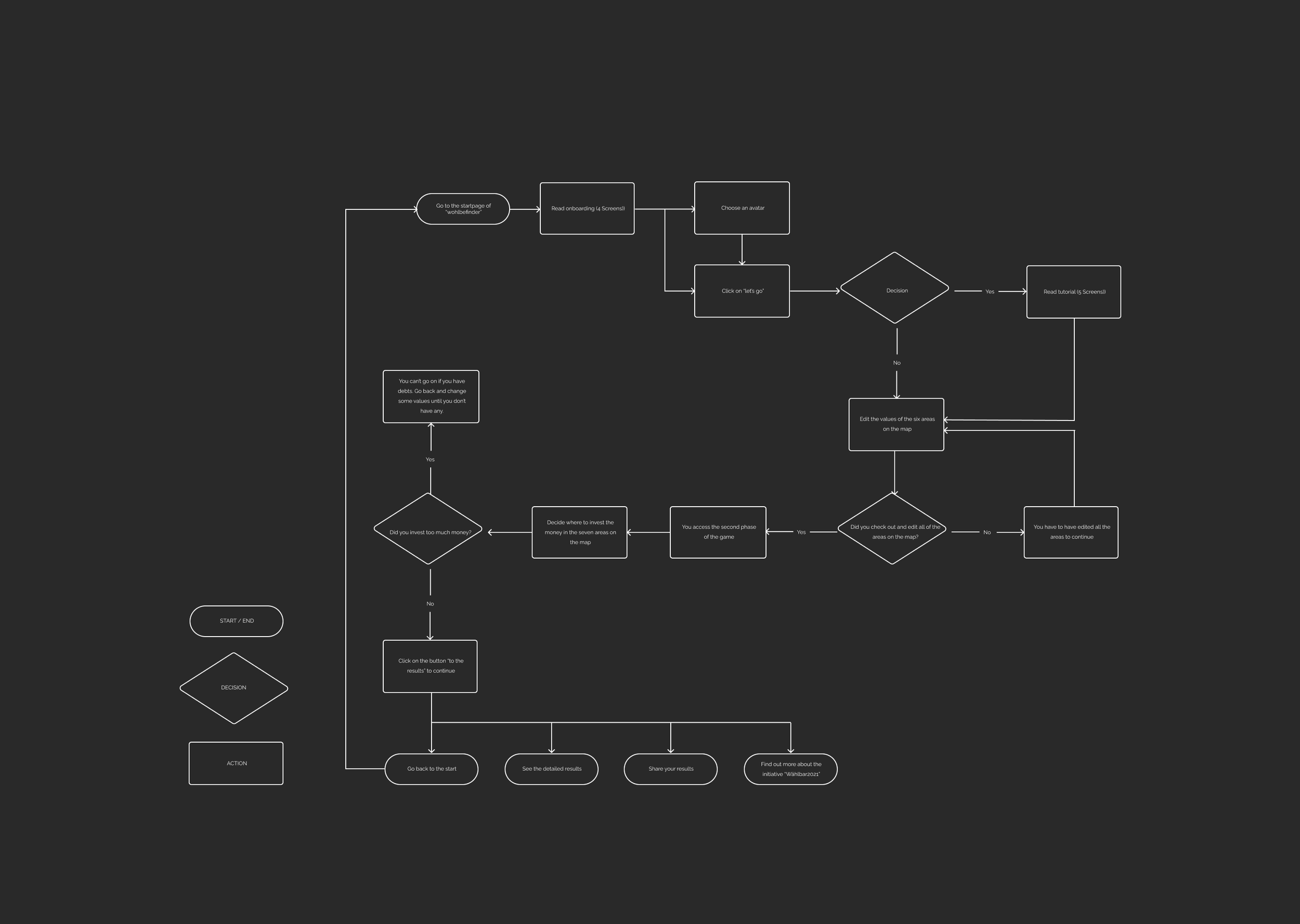
Task Flow
Wireframes

Brand Design

Logotypes positive & negative
Typeface
Brand colors

UI Design
For the design, we used the map as the main element with the illustrations guiding the game.
For the target group it was important that it looked friendly and inviting, yet playful enough to make the process entertaining.


Tests with users
THE USERS

10 users
Who tested the web application in different stages of the process in 1:1 videocalls with screensharing using the method of the cognitive walktrough.
5 users
From the target group, who tested the app in different stages of the process in group videocalls using the method of the cognitive walktrough and talking among each other.
THE INSIGHTS
What didn’t work
In the beginning the users didn’t understand the navigation through the map because it only contained icons.
The texts were too scientific and complex
The avatars were not inclusive enough and it irritated the users
What worked
The users liked being able to personalise their avatar
They were interested in reading the informations and playing around with the sliders
4 out of 5 users were willing to share their results with close friends
User ideas
Having less text and with highlighted parts to find the important information faster
Having some value in the results as a comparison to the own results, for example how ones results are in comparison to what the German government is doing
TAKEAWAYS
TAKEAWAYS
Every member of the project should be part of the process since the beginning: developers, UX Writers, designers and client.
It should be very clear since the beginning how much will be needed from the client (will they deliver the texts, how often are they available for feedback rounds...)
We certainly learned a lot about the CO2 Tax
It should be clear who has “the final word” in making decisions, whether it should be the client or the project manager.